Website Redesign & SEO
Plandscape Website Redesign
Plandscape is a premium commercial and residential landscaping service that has served Illinois' Kane county since 1988. The company is known for its intricate landscape design and construction projects, combining thoughtful ornamental plant selection with functional patios, and other hardscape features. Plandscape approached N2 Solutions for help updating their website, which lacked proper functionality features and did not reflect the company's high bar for quality.

Process Overview
The objective was to create a sophisticated, user-centered website that reflected the brand's high-end work while improving usability, clarity, and conversion.
Research
The process began with an evaluation of Plandscape's existing site to identify specific growth areas. Our team took time to browse competitor websites to understand where Plandscape was lacking features and how we could help the brand stand out.
Sitemap
A comprehensive sitemapping phase gave us a holistic view of site navigation and helped us to understand the context that each page exists within. Plandscape had many projects and services to showcase, so easy navigation was a high priority.
Wireframes
From landscaping services to community involvement and individual project case studies, there was a wealth of information that needed to be properly organized for each page. Each wireframe served as an outline for each page, allowing designers and content writers to expedite their process while maintaining alignment.
Final Redesign
Thoughtful pre-planning led to an efficient buildout process. Customized code and plugins, such as a dynamic services menu, added user functionality. Plandscape's site was completed ahead of schedule, allowing more time for feedback and adjustments from their team.
The Problem
Every website redesign begins with a thorough audit of the existing site. Plandscape's site had an outdated look, was missing specific functionality and even lacked some key service information.
Navigation: Service pages were only accessible through the home page menu. The “services” button in the top navigation was linked to an entirely separate process page. Some pages were live but not tied to any site navigation.
SEO Optimization: On-page SEO health was hindered by outdated design choices, and oversights, including haphazard placement of h1 hierarchy tags and missing meta descriptions.
Content: a handful of Plandscape’s services were incorrect or missing entirely. There was also no mention of Plandscape’s extensive community involvement and philanthropy work.
Design: The site lacked visual appeal, was not optimized for mobile and did not look "professional," as one Plandscape team member put it.
Objectives
Fully responsive
A seamless experience across every device, from desktop to mobile.
Visual consistency
A cohesive design system that maintains a polished, unified look across every page.
Optimize content structure
Content organized to guide visitors naturally toward the information that matters.
Design Features
Dynamic Data
We made use of dynamic WordPress templates for the Plandscape site's project and service pages. The system allows data to be entered into a preexisting template using the divi theme builder and custom ACF fields. Along with a uniform look and layout, more project and service pages can be added to the site without a large design lift.

Navigation
Site navaigation is easy and intuitive, with unique, clearly defined labels for each page on both the top and dynamic menus. The dynamic menu had service icons, subtle animations, background color and shading add visual flair and clarity. The end result is a seamless experience between pages.
Transformations
Our favorite site designs have unique visual widgets that add depth and functionality. The original "transformations" page had two unlabeled before and after photos next to each other. A simple slider allows users to see backyard transformations in action, with new copy to add context.


Back End
On the back end, users can enter content, photos and other information directly into pre-built containers that correspond with modules on the front end.
Front End
Information and photos entered are automatically formatted for the front end without need for adjustment. ACF modules can be built as simple text boxes, animated photo galleries, FAQs and more.

Wireframes
Like Plandscape's landscape architects draft their designs on blueprints before breaking ground, we use wireframes to lay pages out before ever touching WordPress. We consider what content, visual elements and functionality we'll need for each page, saving time and eliminating surprises.

Improved Wireframe Features
We used our wireframes as a space to design unique page features. See below for some highlights.
Homepage
A new services menu was built for the homepage, organized around diamond icons for a luxury modern look still in line with the existing branding. A smaller version of this same menu exists on the service and projects pages for easier navigation between them.

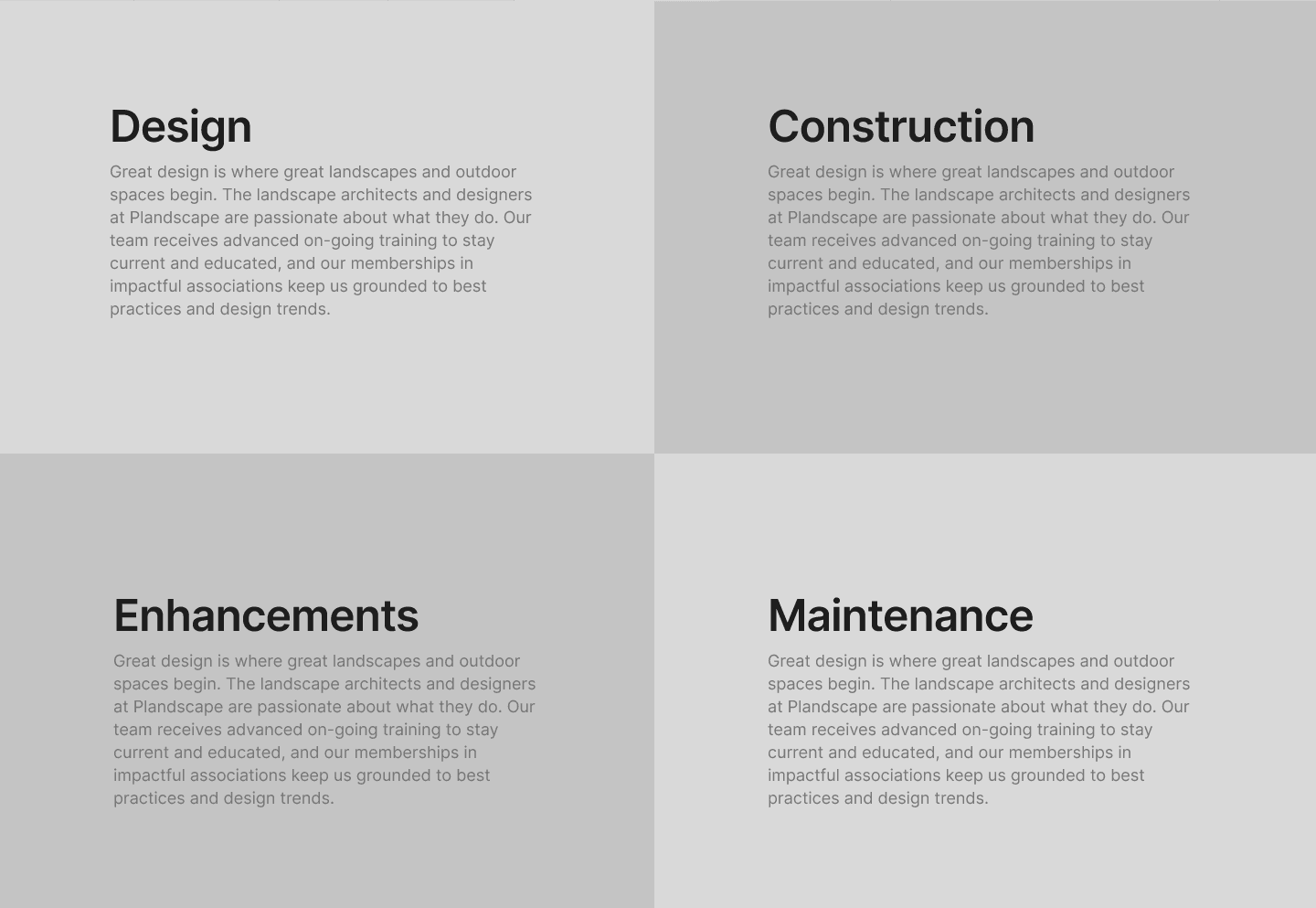
How We Work
We opted for a unique four square pattern as a unique way to display Plandscape's project process. Background photos and colors were carefully chosen so as to not overwhelm the user with four big blocks of text.
Project Page
We rewrote each project spotlight page to give them each a narrative to follow. Our intent was to make readers feel as if they were there on a jobsite observing each step of the process. Each project was matched to a specific service (hardscapes, greenscapes, outdoor kitchens, etc) to add more connection to each service.

Design System
Plandscape already had a defined visual identity and color palette, seen already on trucks, uniforms and printed materials. Our design team integrated existing branding into the site, expanding where necessary to fill visual gaps in a way that felt natural.
Typography
Besides a few spots, most of the existing website's content was styled in Times New Roman, with no distinction between headings and paragraph text. Libre Baskerville and Work Sans font families were added as subheading and paragraph text to more easily differentiate site content.
Libre Baskerville
A B C D E F G H I J K L M N O P Q R S T U V W X Y Z
a b c d e f g h i j k l m n o p q r s t u v w x y z
1 2 3 4 5 6 7 8 9 0
! @ # $ % ^ & * ( ) _ + - = [ ] { } ; : ' " , . < > / ? | \ ` ~
Work Sans
A B C D E F G H I J K L M N O P Q R S T U V W X Y Z
a b c d e f g h i j k l m n o p q r s t u v w x y z
1 2 3 4 5 6 7 8 9 0
! @ # $ % ^ & * ( ) _ + - = [ ] { } ; : ' " , . < > / ? | \ ` ~
Colors
Plandscape's existing brand colors were used throughout the site, with additional colors added as needed for headings and backgrounds. The heavy use of both dark and light green tones evoke Plandscape's work in Kane county.
Design Elements
Small design elements, such as divider lines between sections, shapes and other small pieces may not take center stage visually, but the added flair helps sites stand out.

These diamonds are the most prevalent in the new animated icons for each individual service. Small choices like these leave a huge impact in helping the site stand out from others that opt for more standard graphics.
Our team opted for a diamond shape for certain graphics to further lean into a "luxury" aesthetic for the site. You can spot the diamond motif in small details, such as this section divider, as a means to add extra flair throughout the site.
Conclusion
Plandscape's website was visually outdated and difficult to navigate; it was time for a refresh! N2 Solutions delivered a final product that was easy to navigate and better aligned to modern design standards. A thorough pre-planning process allowed for a buildout process easier than a quick prune and trim in the garden.
Results and Highlights
Better navigation for a streamlined user experience.
Modernized design in line with other sites in the industry.
Easy expansion for new pages thanks to intuitive templates.


